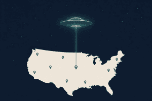
Mapped: US UFO Sightings by State and the 15 Most Famous UAP Cases — After the Pentagon’s May 2026 File Release
The Pentagon’s AARO office released a second batch of declassified UFO files on May 22, 2026 — cumulative archive over 200 documents from the 1940s to today, including Apollo 12 + Apollo 17 lunar imagery. Mapped: the 15 most-cited historical US UAP incidents (Roswell, Phoenix Lights, USS Nimitz Tic Tac, USS Roosevelt Gimbal, more), plus NUFORC’s state-by-state ranking — California leads at 17,158 reports, Florida at 8,880, Washington at 7,633.