Key Takeaways
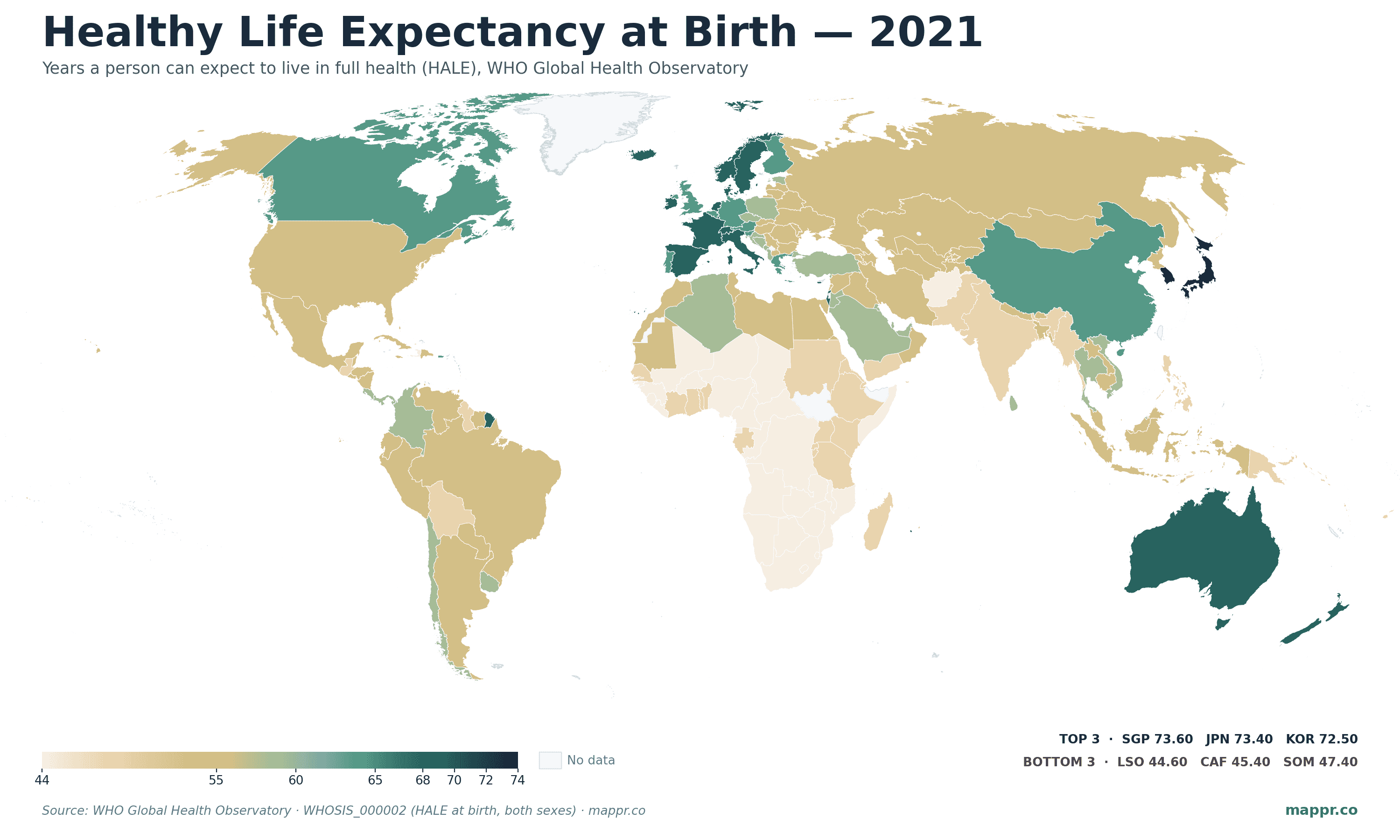
- Singapore tops the world at 73.6 healthy years. Japan (73.4) and South Korea (72.5) round out the top three. East Asia dominates the leaderboard alongside small wealthy European states.
- 30-year span between top and bottom. Lesotho's HALE of 44.6 years vs Singapore's 73.6 — a 29-year gap that maps almost perfectly onto income and disease burden.
- Wealthy ≠ healthiest for the longest. Australia and the United States are tied for the world's largest gap between life expectancy and HALE: 12.5 years lived in poor health on average. Switzerland and New Zealand close behind at 12.2.
- The U.S. underperforms its income peers. American HALE is 63.9 years — lower than Cuba, Vietnam, China, and roughly 40 other countries far less wealthy. The U.S. also has the joint-largest HALE gap, meaning Americans live more years in poor health than nearly anyone.
- HALE vs life expectancy: the right number. Headline life expectancy counts years lived but treats a year on dialysis the same as a year hiking. HALE subtracts the disability burden — and tells a very different story about which countries are actually keeping their people healthy.
The World Health Organization’s Healthy Life Expectancy at Birth (HALE) indicator is one of the more revealing single-number measures of national health. Unlike standard life expectancy, which simply counts years lived regardless of condition, HALE applies a disability weighting — a year spent immobile or on dialysis counts for less than a year spent healthy and active. The result is closer to “years of life you’d actually want to live.”
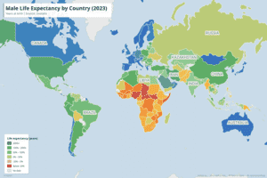
The latest publicly comparable HALE estimates put Singapore at the top of the world (73.6 years), followed by Japan (73.4), South Korea (72.5), Iceland (71.4), and a cluster of small wealthy European states (Luxembourg, Norway, Switzerland, Sweden, Spain) within a fraction of a year of each other. Lesotho sits at the other end at 44.6, with Central African Republic (45.4), Somalia (47.4), and Eswatini (47.5) close behind. That 29-year gap is one of the starkest in any global health indicator.
What HALE Measures and Why It Differs from Life Expectancy
Life expectancy at birth tells you how long a baby born today can expect to live, given current mortality rates by age. It treats all years equally. HALE goes a step further: it weights each year by the average level of disability or ill-health at that age, derived from the Global Burden of Disease (GBD) framework. A year spent with severe stroke disability might count as 0.4 years of healthy life; a year free of significant impairment counts as 1.0.
The arithmetic is straightforward, but the interpretive shift is significant. In all 185 countries with publicly comparable data, HALE is lower than life expectancy. The gap between the two — how many years a person is expected to spend with significant ill-health — turns out to vary widely. And that gap is exactly where the wealthy West fares worst.
The 20 Countries with the Healthiest Years to Live
The top of the ranking is dominated by three Asian states plus a cluster of small wealthy European countries. Notably, the headline life-expectancy leaders (Monaco, Liechtenstein, San Marino) don’t all top this list — Singapore and Japan have somewhat better disability-adjusted profiles than raw mortality alone would suggest.
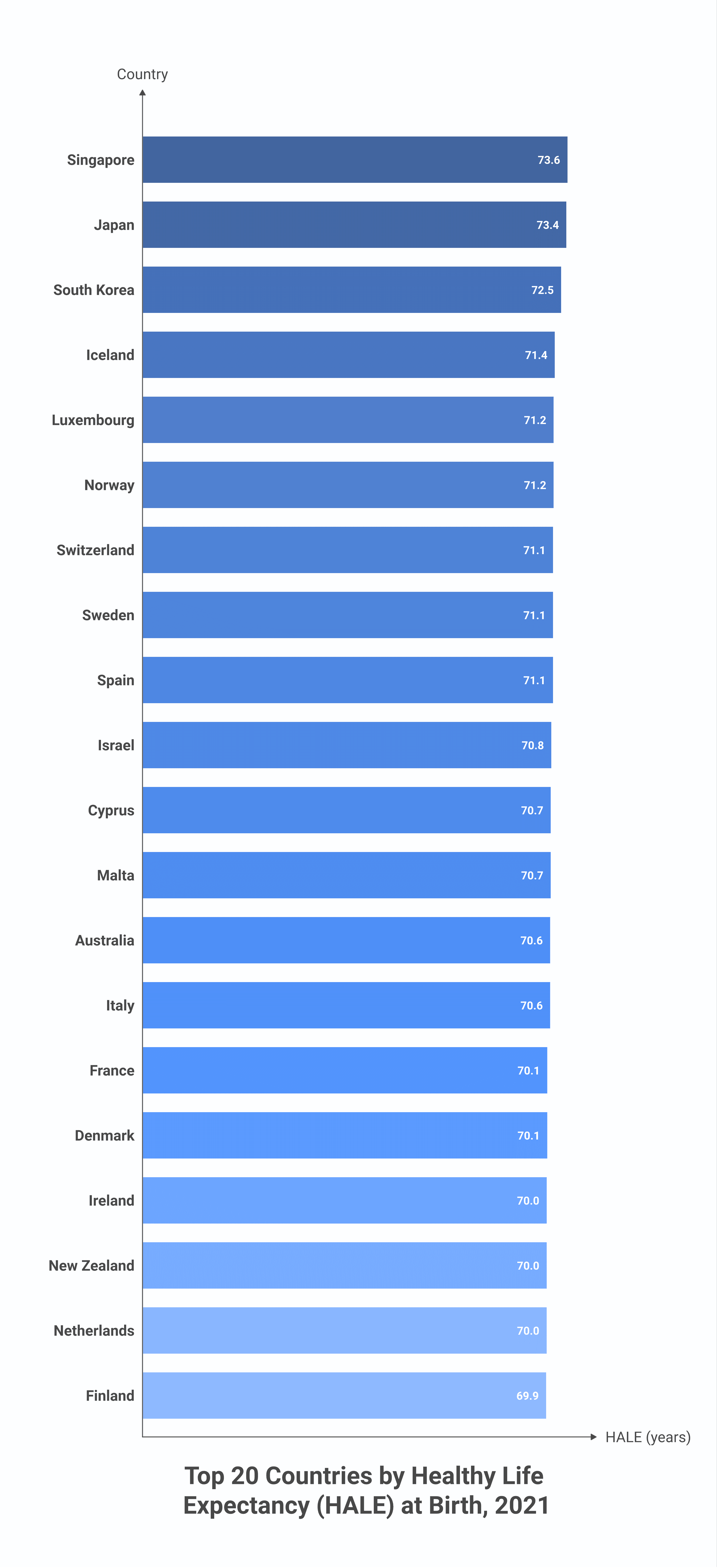
| Rank | Country | HALE (years) | Life Expectancy | Years in Poor Health |
|---|---|---|---|---|
| 1 | 🇸🇬 Singapore | 73.6 | 83.9 | 10.2 |
| 2 | 🇯🇵 Japan | 73.4 | 84.5 | 11.1 |
| 3 | 🇰🇷 South Korea | 72.5 | 83.8 | 11.3 |
| 4 | 🇮🇸 Iceland | 71.4 | 82.6 | 11.2 |
| 5 | 🇱🇺 Luxembourg | 71.2 | 82.8 | 11.5 |
| 6 | 🇳🇴 Norway | 71.2 | 82.9 | 11.7 |
| 7 | 🇨🇭 Switzerland | 71.1 | 83.3 | 12.2 |
| 8 | 🇸🇪 Sweden | 71.1 | 82.7 | 11.5 |
| 9 | 🇪🇸 Spain | 71.1 | 82.7 | 11.6 |
| 10 | 🇮🇱 Israel | 70.8 | 81.7 | 11.0 |
The Counterintuitive Twist: Wealth Buys More Years in Poor Health
Subtract HALE from life expectancy and you get the average number of years a person is expected to live with significant disability or poor health. The countries with the largest such gaps are not the world’s poorest — they are some of its wealthiest:
| Rank | Country | Life Expectancy | HALE | Years in Poor Health |
|---|---|---|---|---|
| 1 | 🇦🇺 Australia | 83.1 | 70.6 | 12.5 |
| 1 | 🇺🇸 United States | 76.4 | 63.9 | 12.5 |
| 3 | 🇳🇿 New Zealand | 82.2 | 70.0 | 12.2 |
| 3 | 🇨🇭 Switzerland | 83.3 | 71.1 | 12.2 |
| 5 | 🇫🇷 France | 81.9 | 70.1 | 11.8 |
| 6 | 🇨🇦 Canada | 81.6 | 69.8 | 11.8 |
| 7 | 🇳🇴 Norway | 82.9 | 71.2 | 11.7 |
| 7 | 🇧🇪 Belgium | 81.5 | 69.8 | 11.7 |
| 9 | 🇵🇹 Portugal | 81.2 | 69.5 | 11.7 |
| 10 | 🇮🇹 Italy | 82.2 | 70.6 | 11.6 |
The pattern is real and somewhat counterintuitive: wealthy healthcare systems are very good at extending life, including for people with chronic conditions, but extending life and extending healthy life are not the same thing. Australia, the U.S., New Zealand, and Switzerland all have excellent medical systems that keep stroke survivors, cancer patients, and people with advanced diabetes or heart disease alive far longer than they would survive in poorer countries — but those years often involve significant impairment.
The flip side is bleak. The countries with the smallest HALE-vs-LE gaps are mostly Sub-Saharan African nations with very low life expectancy overall — Lesotho’s gap of 6.8 years isn’t a sign of better aging, it’s a sign that people don’t live long enough to accumulate years in poor health. The gap shrinks when life is short.
The American Anomaly
The United States stands out twice in this data. Its HALE of 63.9 years is the lowest among high-income countries by a substantial margin — roughly 7 years below the Singapore/Japan/Korea cluster, more than 6 below Western Europe, and lower than Cuba (68.8), Vietnam (65.7), and China (68.6). And its HALE gap of 12.5 years ties Australia for the largest in the world.
The mechanisms are well-documented elsewhere: an obesity epidemic, the opioid and overdose crisis, weaker primary care access for the uninsured, higher firearm and motor vehicle mortality among working-age adults, and worsening maternal mortality. None of these alone closes a 7-year HALE gap with peer economies — together, they do. The U.S. is a wealthy country with a middle-income health profile.
The Bottom of the Map: HIV and Conflict
The five lowest-HALE countries are Lesotho (44.6), Central African Republic (45.4), Somalia (47.4), Eswatini (47.5), and Mozambique (49.7). Two are in southern Africa where the HIV/AIDS epidemic still drives a substantial portion of premature mortality despite anti-retroviral therapy rollout. The other two — CAR and Somalia — combine chronic underdevelopment with active conflict and weak health infrastructure.
For perspective: a child born in Lesotho today can expect roughly the same healthy life expectancy as a child born in Norway in 1900. The Singapore-Lesotho gap of 29 years is larger than the entire gain in U.S. life expectancy over the 20th century.
Methodology and Vintage
HALE estimates require both a current life table (deaths by age) and an age-specific disability weighting derived from the Global Burden of Disease study. The figures used here are from the WHO Global Health Observatory indicator WHOSIS_000002 (Healthy life expectancy at birth, both sexes), most recently published for the 2021 reference year. IHME’s GBD 2023 release (published late 2024) contains independent HALE estimates using a slightly different methodology, with broadly similar country rankings but small numerical differences at the country level. Both data sources point at the same headline conclusion: the U.S. underperforms its income peers, East Asia outperforms, and the wealthy world generally pays for its longevity in years of poor health.
Conclusion
HALE is the closest single number we have to “years you’d actually want to live.” It separates the question of how long people live from the question of how well they live in those years. The map shows the geography of healthy aging — and the table beneath it shows that healthy aging is not always best where life is longest. Singapore, Japan, and South Korea lead the world in both dimensions. The United States leads in neither. And the smallest gap between expected life and expected healthy life — paradoxically — sits in the countries where life is shortest. Living long enough to grow old in poor health is, by global standards, still a wealthy-country privilege.
This post uses Healthy Life Expectancy (HALE) and Life Expectancy at Birth (LE) data published by the World Health Organization's Global Health Observatory. Both indicators use 2021 reference year (the most recent year with comparable cross-country estimates), age-standardised at birth, both sexes combined. The HALE gap is computed as LE minus HALE.
Primary Data Sources:
- WHO — Healthy life expectancy (HALE) at birth, WHOSIS_000002 – GHO API endpoint for HALE at birth by country, year, and sex. 2021 vintage used for this post.
- WHO — Life expectancy at birth, WHOSIS_000001 – Companion GHO endpoint for total life expectancy at birth, used to compute the HALE gap.
- IHME — Global Burden of Disease 2023 – Independent HALE estimates from the GBD 2023 release; numerical values differ slightly from WHO but country rankings are broadly consistent.
Image Sources:
- Couple walking by a fountain in a park — Mobio Marketing on Unsplash – Featured image.