
Key Takeaways
- Switzerland is the priciest. PLI of 125.8 in 2024 — household costs are 26% higher than in the US baseline.
- Nigeria is the cheapest. PLI of 18.0 — a dollar buys roughly 5.5x more local household consumption than in the US.
- US = 100, by design. The April 2026 WDI release standardised the price level index so the United States is exactly 100; every other country reads as a percentage of US household prices.
- Rich ≠ expensive. Norway, Singapore, and the Gulf petrostates rank well below their GDP-per-capita peers — high wealth, mid-cluster prices.
- Geography of affordability. Sub-Saharan Africa, South Asia, and the MENA crisis economies dominate the cheap end; advanced Europe + the Anglosphere dominate the expensive end.
If you swap a US dollar for Swiss francs and buy a week of groceries in Zurich, you will spend 26% more than the same basket would cost in the United States. Do the swap in Lagos and you will spend less than a fifth. That is the Price Level Index in one paragraph — and the World Bank’s April 2026 World Development Indicators release just put a sharper number on it.
The April 2026 vintage of the WDI introduced a new household price level index (indicator PA.NUS.PRVT.PLI) calibrated so the United States equals 100. Every other economy now reads as a percentage of US household-consumption price levels. Below: the global map, the most and least expensive countries to live in, and why rich and expensive aren’t always the same place.
How the Price Level Index works
The household Price Level Index (PLI) is the ratio of a country’s purchasing-power-parity conversion factor for household consumption to its market exchange rate, multiplied by 100. Where the index is high, the same basket of household goods and services costs more in dollars. Where it is low, your dollar stretches further once converted into the local currency.
Before the April 2026 release, the equivalent indicator was expressed against the world average, which made cross-country comparison fiddly. The new index rebases everything to the US (= 100), so reading the map is now direct: a value of 50 means household prices are half of US levels; a value of 120 means they are 20% higher.
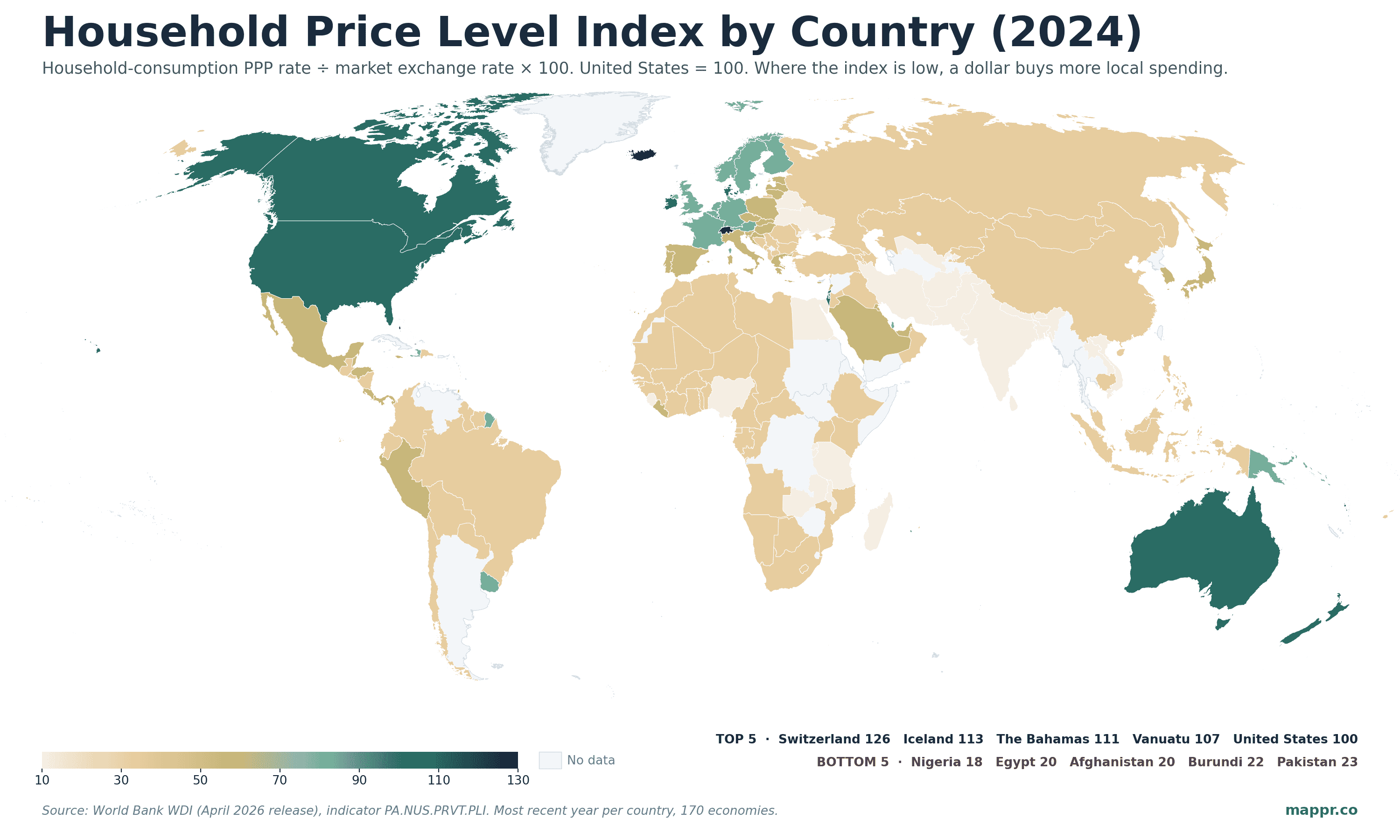
One striking pattern is the cluster of small island economies sitting at the top — the Bahamas (110.7), Vanuatu (106.6), Palau (99.3). Tiny economies with most goods imported tend to pay a logistics premium that shows up directly in the index. The expensive cluster of large advanced economies sits just below the US: Denmark (98.1), Israel (97.5), Ireland (95.5), Australia (93.6).
The most expensive countries for household consumption
Switzerland is the standalone leader at 125.8 — the only economy of any size where everyday household prices run materially above the United States. Iceland (113.1) is the only other advanced economy above 110. After that, the small Caribbean and Pacific island economies take over — locales where freight, scale, and tourism markups push prices up well past the US baseline.
Top 10 · Most Expensive
The 10 most expensive countries for household consumption
Household Price Level Index, latest year per country (most are 2024). United States = 100; values above 100 mean household goods cost more than in the US.
| Country | PLI (US=100) | Year |
|---|---|---|
| Switzerland | 125.8 | 2024 |
| Iceland | 113.1 | 2024 |
| The Bahamas | 110.7 | 2024 |
| Vanuatu | 106.6 | 2023 |
| United States | 100.0 | 2024 |
| Palau | 99.3 | 2024 |
| Denmark | 98.1 | 2024 |
| Israel | 97.5 | 2024 |
| Ireland | 95.5 | 2024 |
| Australia | 93.6 | 2024 |
The cheapest countries for household consumption
Nigeria (18.0) is the world’s cheapest country to buy a household consumption basket in dollar terms — a number that has slid sharply since the 2023 naira devaluation. Egypt (19.5) tells the same story: a series of currency crises since 2022 has pushed the pound down by roughly two-thirds against the dollar, while domestic prices haven’t kept up. Currency weakness is the engine driving most of the bottom of this list, not low cost-of-production fundamentals.
Bottom 10 · Cheapest
The 10 cheapest countries for household consumption
These are the economies where a US dollar stretches furthest at market exchange rates. Crisis economies and the largest emerging markets dominate the bottom of the index.
| Country | PLI (US=100) | Year |
|---|---|---|
| Tanzania | 25.3 | 2024 |
| Belarus | 25.2 | 2024 |
| Iran | 25.2 | 2024 |
| Bhutan | 25.0 | 2024 |
| India | 23.5 | 2024 |
| Pakistan | 22.9 | 2024 |
| Burundi | 21.6 | 2024 |
| Afghanistan | 19.9 | 2024 |
| Egypt | 19.5 | 2024 |
| Nigeria | 18.0 | 2024 |
PPP rich, life cheap — the paradox
The most counter-intuitive reading of the map is what’s missing from the top. Norway, one of the richest countries in the world by GDP per capita PPP, sits at 88.8 — below the US, below Australia, below Denmark. Singapore — the headline-grabbing wealth capital of Asia — sits at 78.0, well below France or Germany. Luxembourg, the world’s richest country on most lists, is 91.5.
Why? GDP per capita PPP measures income stripped of price differences. The PLI measures the prices themselves. A country can be rich because its citizens earn enough international-dollar income to buy a lot, without that wealth necessarily inflating its domestic price level — especially when wealth is concentrated in financial or extractive sectors that don’t push up everyday goods and services. Norway’s sovereign-wealth model and Singapore’s tax structure both fit that profile.
The reverse pattern shows up at the top of the PLI list: Switzerland, Denmark, Australia. These economies have both high per-capita incomes and domestic wage structures that translate into expensive everyday goods — high labour costs feed through to restaurant prices, rent, services, and the consumer basket overall.
What the index actually tells you
The household PLI is a single number that compresses a question expats, remote workers, retirees, and humanitarian agencies all ask: how much further does my money go in this country? Pair the index with a salary or pension figure converted at market exchange rates, and you have a first-pass estimate of relative purchasing power.
The caveats are non-trivial. The PLI is an average across a national consumption basket — it doesn’t capture how unevenly prices are distributed inside a country, the gap between a capital city and a rural province, or quality differences. Two economies with a PLI of 50 can feel very different on the ground if one of them has expensive housing offset by cheap food, and the other has the inverse. For a more granular comparison at the city level, the Mappr cost-of-living tool goes deeper.
For development analysts the use case is different. The PLI is one of the underlying ingredients in the PPP-adjusted income, consumption, and poverty measures that drive most cross-country comparisons of living standards. A higher-quality PLI feeds through to more accurate measures of how many people live in poverty, how unequal countries really are when prices are controlled for, and whether income convergence between rich and poor economies is real or partly a currency artefact. The April 2026 WDI release moved the entire chain forward.
Data and methodology references for this post.
Image Sources
- Featured photo — Arisa S. via Unsplash – https://unsplash.com/photos/a-shopping-cart-with-a-note-attached-to-it-8ChFHihPGEU
For a single-product take on the same idea, see our map of the Big Mac Index.