Key Takeaways
- The UN just voted on how the world should look. On 4 September 2026, the UN General Assembly passed the 'Correct the Map' resolution, endorsing the Equal Earth projection over Mercator: 164 votes in favour, 6 abstentions, and a single vote against, the United States.
- Mercator shrinks Africa, badly. On the Mercator map, Greenland looks nearly the size of Africa. In reality Africa is about 14 times larger, big enough to hold the mainland US, China, India and most of Europe at once.
- An African-led campaign, decades in the making. The resolution grew out of the African Union's 'Correct the Map' campaign and was led by Togo, framing accurate maps as a matter of 'cognitive justice': how big a place looks shapes how important it feels.
- It's a nudge, not a ban. The resolution is non-binding. Mercator remains unbeatable for navigation and web maps, but the UN now asks schools, governments and tech companies to reach for equal-area maps like Equal Earth whenever relative size matters.
Every map of the world is a lie of some kind; flattening a sphere forces choices. But some lies have consequences, and on 4 September 2026 the UN General Assembly decided one of them had gone on long enough. By 164 votes to one, with six abstentions, it endorsed the ‘Correct the Map’ resolution: a call to retire the Mercator projection’s shrunken Africa and use maps that show the world’s landmasses at their true relative size.
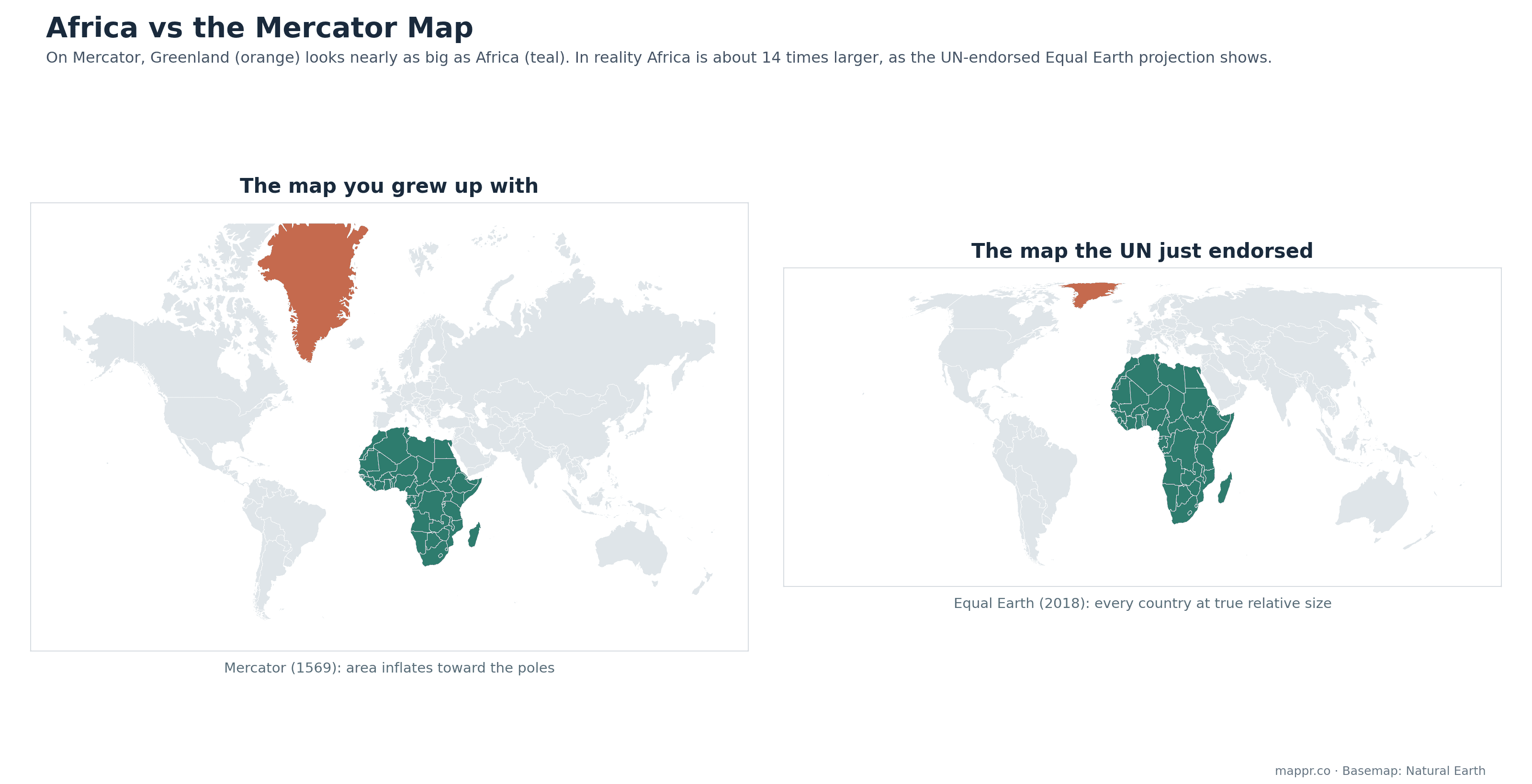
The 457-year-old distortion
Gerardus Mercator drew his map in 1569 for sailors, and for sailors it is genuinely brilliant: a straight line on a Mercator chart is a constant compass bearing. The price is area. The projection stretches the world ever more as you approach the poles, so Greenland balloons to look nearly the size of Africa when Africa is actually about 14 times larger. Europe, Russia and North America all gain visual bulk; the equatorial world, Africa above all, shrinks. Because Mercator became the default of classrooms and, later, of web mapping, generations have grown up with a mental globe that quietly undersizes the continent of 1.5 billion people.
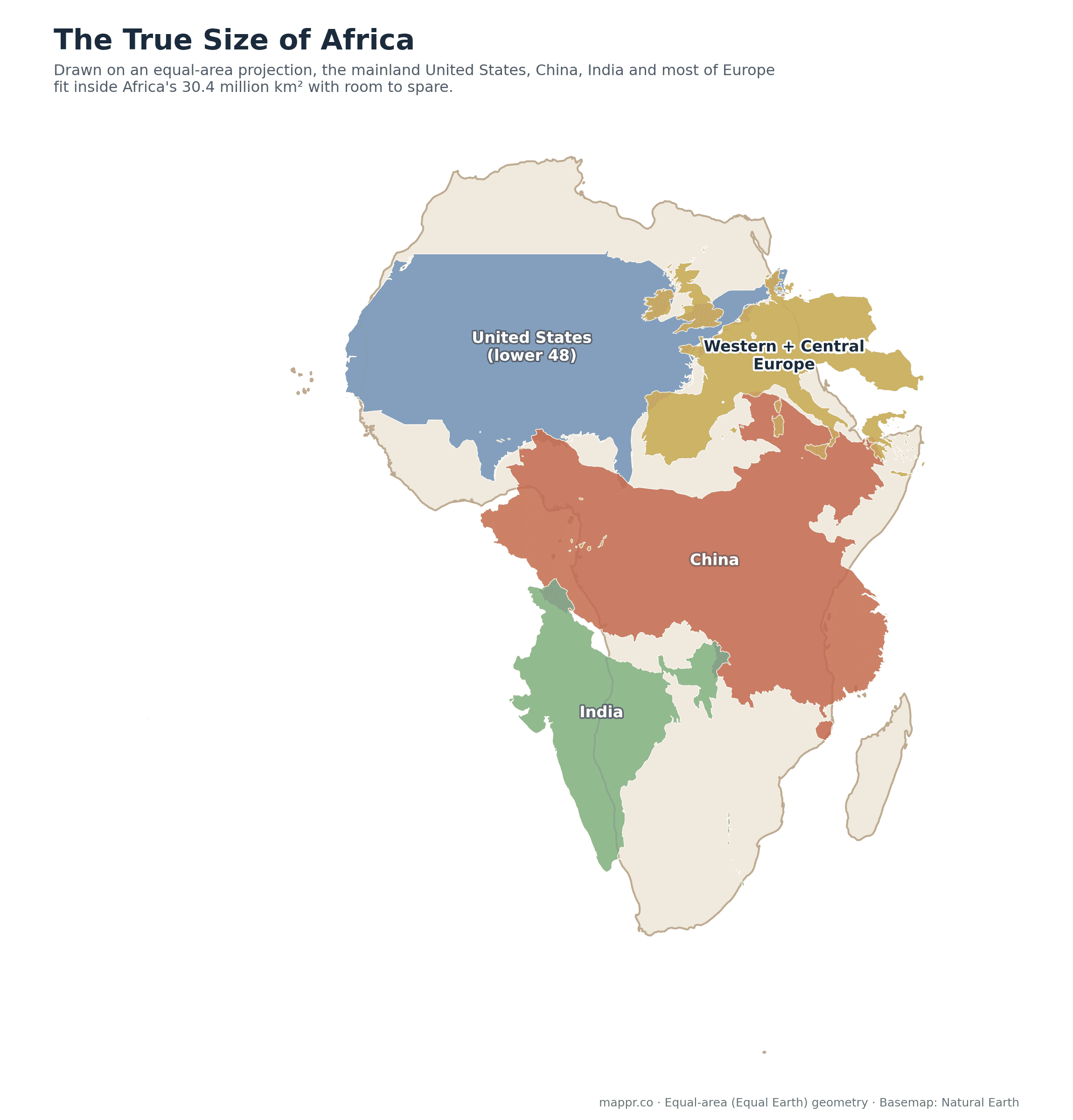
Drawn on an equal-area projection, the point makes itself: the mainland United States, China, India and most of western and central Europe fit inside Africa together, with the Horn, Madagascar and a healthy chunk of the Sahara left over. Africa’s 30.4 million square kilometres exceed the US, China and India combined by roughly a third.
What the UN actually decided
The resolution, tabled by Togo with African Union member states and the Bahamas, endorses the Equal Earth projection, a 2018 design by cartographers Bojan Šavrič, Tom Patterson and Bernhard Jenny that preserves relative area while keeping continents in familiar, pleasing shapes. The text frames the change as ‘cognitive justice and memorial reparation’: the argument that a century of shrunken-Africa maps has fed a shrunken idea of Africa itself, in classrooms, newsrooms and boardrooms. The vote was overwhelming, 164 in favour, and lopsided in a telling way: the United States cast the only vote against, with six abstentions.
A nudge, not a ban
The resolution is non-binding. No atlas will be pulped, and Mercator is not going anywhere: it remains the right tool for navigation, and its mathematical tidiness keeps it under most web maps at street zoom. What changes is the default at the scale where distortion misleads: the UN now formally asks schools, governments, international bodies and technology companies to use Equal Earth or other equal-area projections whenever the map is about comparing places rather than steering ships. Boston’s public schools made a similar switch back in 2017; UN agencies and several African governments are expected to follow their own resolution first.
Maps are power
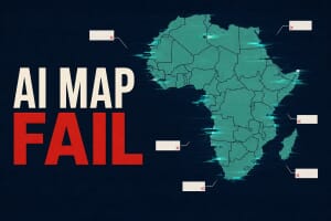
For a site called Mappr, this is the family business: every projection is an argument about what matters. The same month the UN voted, we covered a lake with two names depending on where you stand and, earlier, what happened when an AI tried to draw Africa. The Mercator debate is the oldest of these stories and the biggest: it is about whether the second-largest continent gets to appear on the world’s walls at full size. As of this month, the world’s parliament says it should. For how flat maps bend reality in every direction, keep an eye out for our upcoming visual guide to map projections.