Key Takeaways
- What happened. At the AIDS 2026 conference in Rio de Janeiro, a US State Department presentation on its new health agreements with African countries displayed a map of Africa in which, as attendees and Reuters documented, essentially nothing was in the right place: Nigeria sat landlocked in the Sahara, Mozambique appeared in the Horn of Africa, and Ivory Coast was on the wrong side of the continent.
- It was AI-generated, watermark and all. Reuters found the slide carried a watermark indicating it was made with OpenAI tools. The State Department called it “an unfortunate error” by a team member who hastily modified slides just before the event, and apologized to African partners. OpenAI says it is investigating.
- This failure is structural, not a fluke. Image-generation models paint pictures of maps; they don't consult coordinates or boundary data. We use these tools daily for illustrations at Mappr, and they cannot reliably reproduce real geography without being anchored to actual cartographic data.
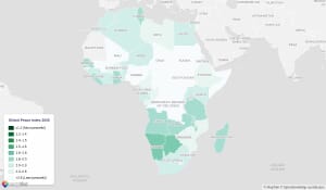
- The real map is below. As a corrective, this post includes an accurate, properly labeled political map of Africa built from real boundary data, plus a map of exactly what the AI slide got wrong.
- How to spot an AI map. Blobby borders that match no real country, labels floating in the wrong place or spelled almost-correctly, impossible geography (coastal countries shown landlocked), and generator watermarks. If a map decision matters, verify against a real atlas.
The United States State Department showed a map of Africa this week in which, by every account, nothing was where it should be. The slide appeared midway through a presentation at the AIDS 2026 conference in Rio de Janeiro, delivered by Jeff Graham, the senior official who heads PEPFAR, the US global AIDS relief program, as he outlined Washington’s new health agreements with African countries.
Attendees photographed the screen and the images spread within hours. Nigeria, a coastal country of 230 million people, sat landlocked in the middle of the Sahara. Mozambique, in the continent’s southeast, appeared in the Horn of Africa. Ivory Coast drifted to the opposite side of the continent. The borders themselves, as Reuters put it, were “mere blobs” that represented no real country. The slide even carried a watermark identifying it as the product of OpenAI tools.
The State Department acknowledged “an unfortunate error,” saying a team member had hastily modified the slides just before the event: “We take full responsibility for the confusion and misrepresentation it caused for attendees, including our African partners.” OpenAI said it is investigating.
We make maps for a living, so consider this post the corrective: the real map of Africa, what exactly the AI got wrong, and why this class of error is guaranteed to keep happening when image generators are asked to do cartography.
Update: days later, Google Earth showed the opposite failure, letting users paste AI-generated fakes onto real satellite imagery before pulling the tool in a day. See Google Earth let people fake satellite images for a day.
The real map of Africa
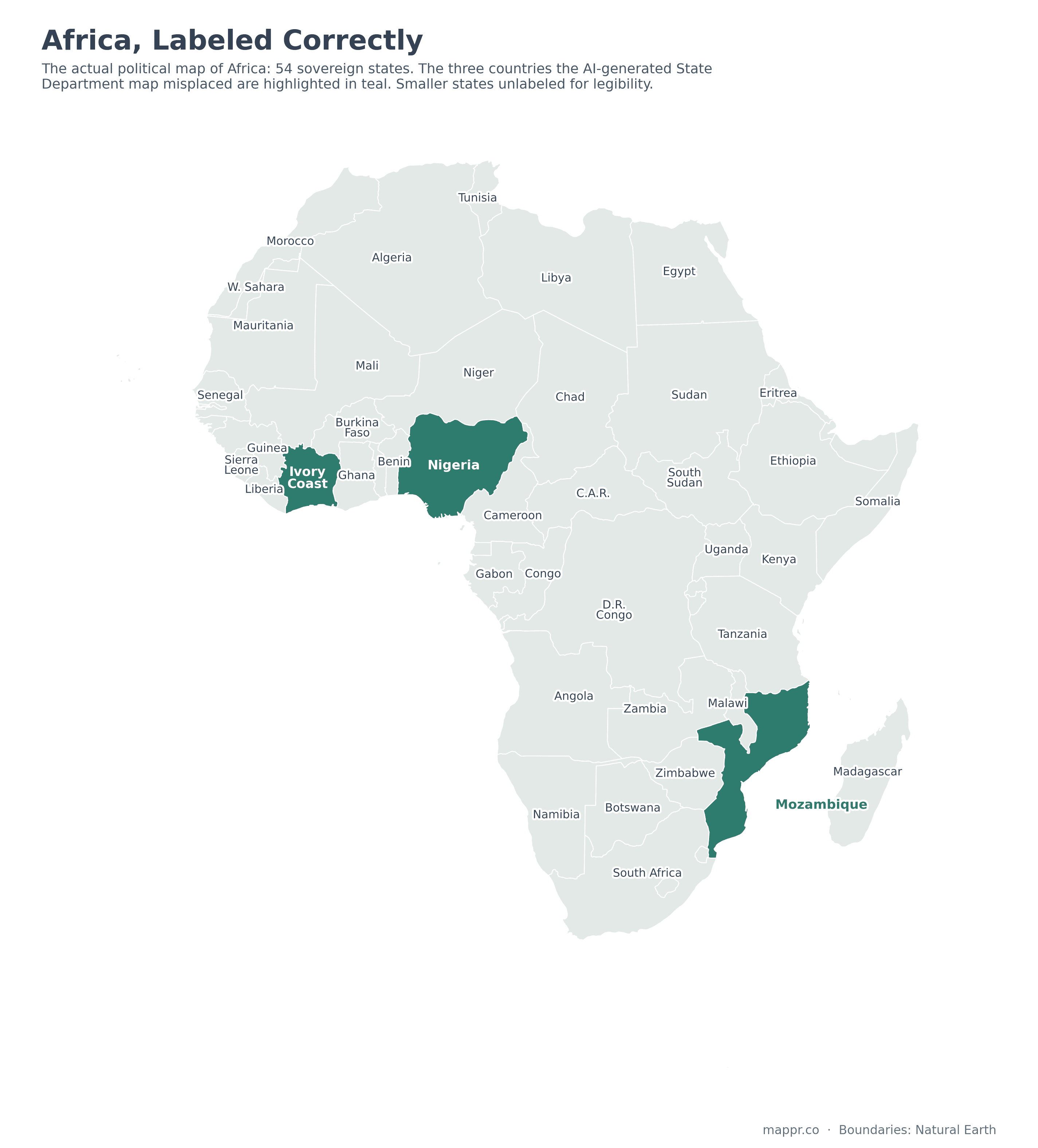
Africa has 54 sovereign states, more than any other continent. Nigeria sits on the Gulf of Guinea in West Africa with roughly 850 km of coastline. Mozambique runs 2,500 km along the Indian Ocean in the southeast. Ivory Coast faces the Atlantic in the west. None of them is remotely ambiguous on a real map, which is what made the slide’s errors so instantly visible to a room full of people who work in these countries.
What the AI map got wrong
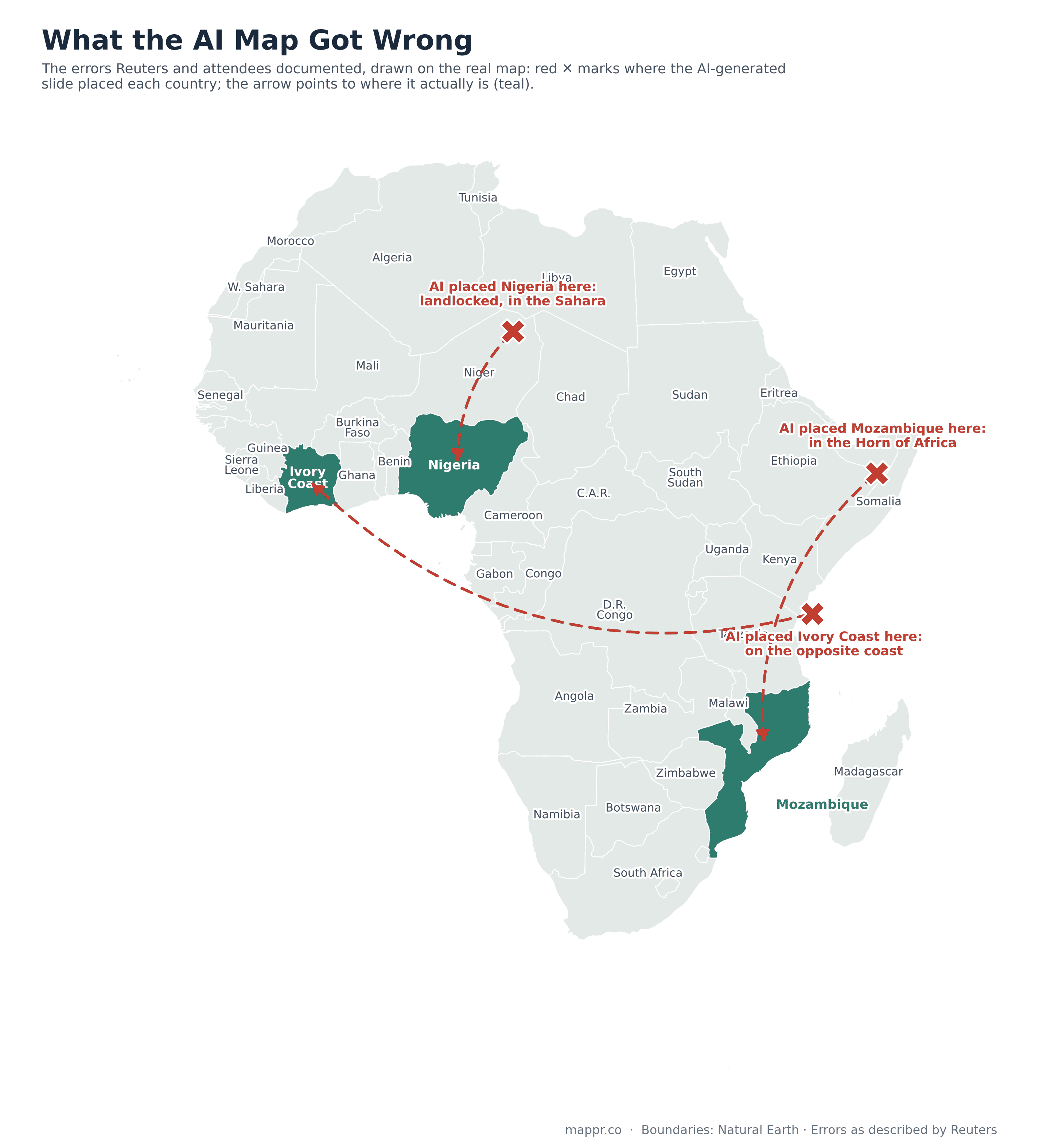
The map above redraws the documented errors on real geography. Each red ✕ marks roughly where the AI slide placed a country, based on the descriptions published by Reuters and the screenshots shared by attendees; the arrows point to where those countries actually are.
Beyond the three headline misplacements, the deeper problem was that the map’s internal boundaries corresponded to nothing at all. It looked map-like without being a map, which is precisely what image-generation AI produces when asked for one.
Why AI can’t label a map
This failure is structural. An image model does not know where Nigeria is. It has no table of coordinates, no boundary files, no gazetteer. It has learned, from millions of images, what maps tend to look like: a familiar continental outline, a patchwork of colored shapes, short text strings scattered across them. When you ask it for a map of Africa, it paints a plausible picture of one, the same way it would paint a plausible bowl of fruit.
We can say this with some confidence because we use these tools every day at Mappr, for illustrations, featured images and editorial artwork. Our standing rule, learned through exactly this kind of failure, is that generative models never produce the geography itself. Every real map on this site is built from actual boundary data (our corrected maps above use the open Natural Earth dataset), and when we want AI artwork that involves a recognizable landmass, we hand the model a geometrically correct silhouette to work from rather than trusting it to draw one. Text labels are the weakest point of all: image models routinely misplace, garble or invent them, which is why label-accuracy is the first thing we check on anything they touch.
In other words: the State Department’s mistake wasn’t using AI. It was asking an image generator to do a database’s job, and then putting the result in front of the people best equipped on Earth to spot the difference.
How to spot an AI-generated map
Check the borders. Real internal boundaries are jagged, irregular and specific; AI boundaries tend toward smooth blobs that match no atlas. Check the labels. Misplaced names, almost-correct spellings and duplicated countries are classic tells. Check the impossible. Coastal states shown landlocked, islands fused to the mainland, lakes in the wrong hemisphere. Check for watermarks, most generators embed them. And if the map is going to inform any real decision, verify it against a source that uses actual cartographic data.
Or skip the guesswork: our Africa map hub has accurate, printable political maps of the continent, and if you want to test whether you can do better than the State Department’s slide, try our Africa map quiz. Spoiler: placing Nigeria correctly puts you ahead.
Sources: