Key Takeaways
- Heat killed a record 710,000 people in 2023. The Lancet Countdown 2026 report, released 28 October ahead of COP31, counts about 710,000 heat-related deaths in 2023, the hottest year it has studied. More than 70% are attributable to human-caused climate change.
- The average person lived through 13.6 heatwave days in 2025. 11.3 of those days would not have happened without climate change. Japan, South Korea, Tajikistan and the Caribbean islands topped 35+ days per person.
- 573 billion work hours evaporated in 2025. Heat cost the average worker 159 potential labour hours last year, worth roughly US$1.07 trillion, about 1% of global GDP. Mali lost 448 hours per worker, Niger 437, Cambodia 410.
- 146 experts want a global health emergency declared. The report's authors are pushing COP31 in November to treat climate change as a health emergency, a call the WHO amplified on 28 October.
The 2026 Report of the Lancet Countdown on Health and Climate Change dropped on 28 October, two weeks before COP31. Its headline number is brutal: around 710,000 people died from heat in 2023, the deadliest year on its record, and more than 70% of those deaths are attributable to human-caused climate change.
A global total that large hides the geography. The burden does not land evenly: it lands on outdoor workforces in the Sahel and South Asia, on islands wrapped in marine heatwaves, and on ageing populations in East Asia and the Mediterranean. So we mapped the Countdown’s per-country indicators, per person, to show where heat actually hits hardest.
The Map: Heatwave Days per Person in 2025
The hero layer is physical exposure: how many heatwave days the average resident of each country lived through in 2025. The world average was 13.6 days, and 11.3 of them would not have occurred without climate change.
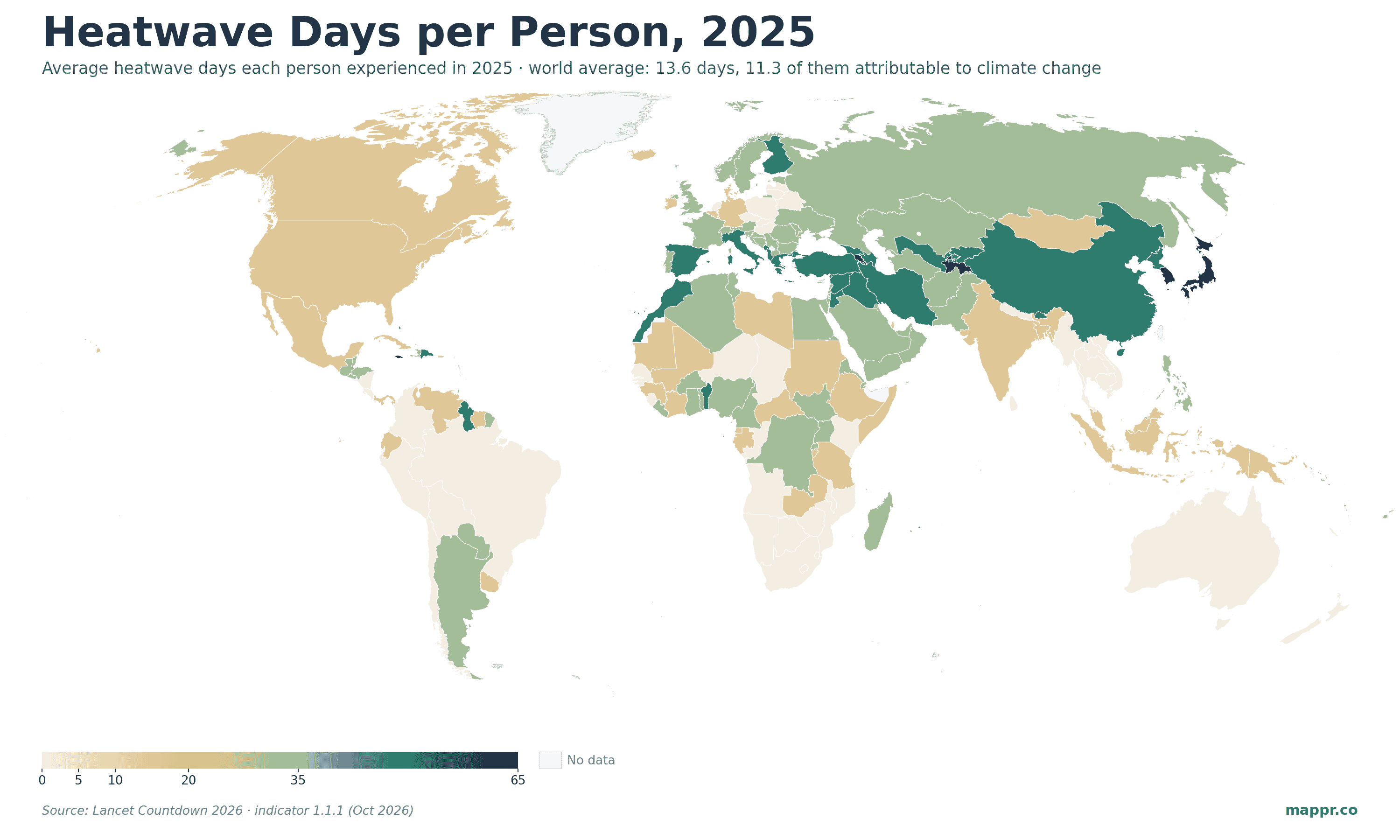
The 2025 pattern is not where intuition puts it. Caribbean islands lead outright: Aruba (62 days), Bermuda (60) and Curaçao (57) spent roughly two months of the year in heatwave conditions, a marine-heatwave signature. East Asia follows: Japan (36 days) and South Korea (35) logged another record-hot summer, and Tajikistan (40) led Central Asia.
Rich countries are not spared on this layer: Spain, Italy and Türkiye all sit in the upper band. Exposure is global; what differs is who can afford to cool down, and who has to work outside through it.
The Second Layer: Work Hours Lost to Heat
The economic layer is where the structural inequality shows. The Countdown estimates 573 billion potential labour hours were lost to heat in 2025, worth about US$1.07 trillion, roughly 1% of global GDP. That is 159 hours per employed person worldwide, nearly four working weeks.
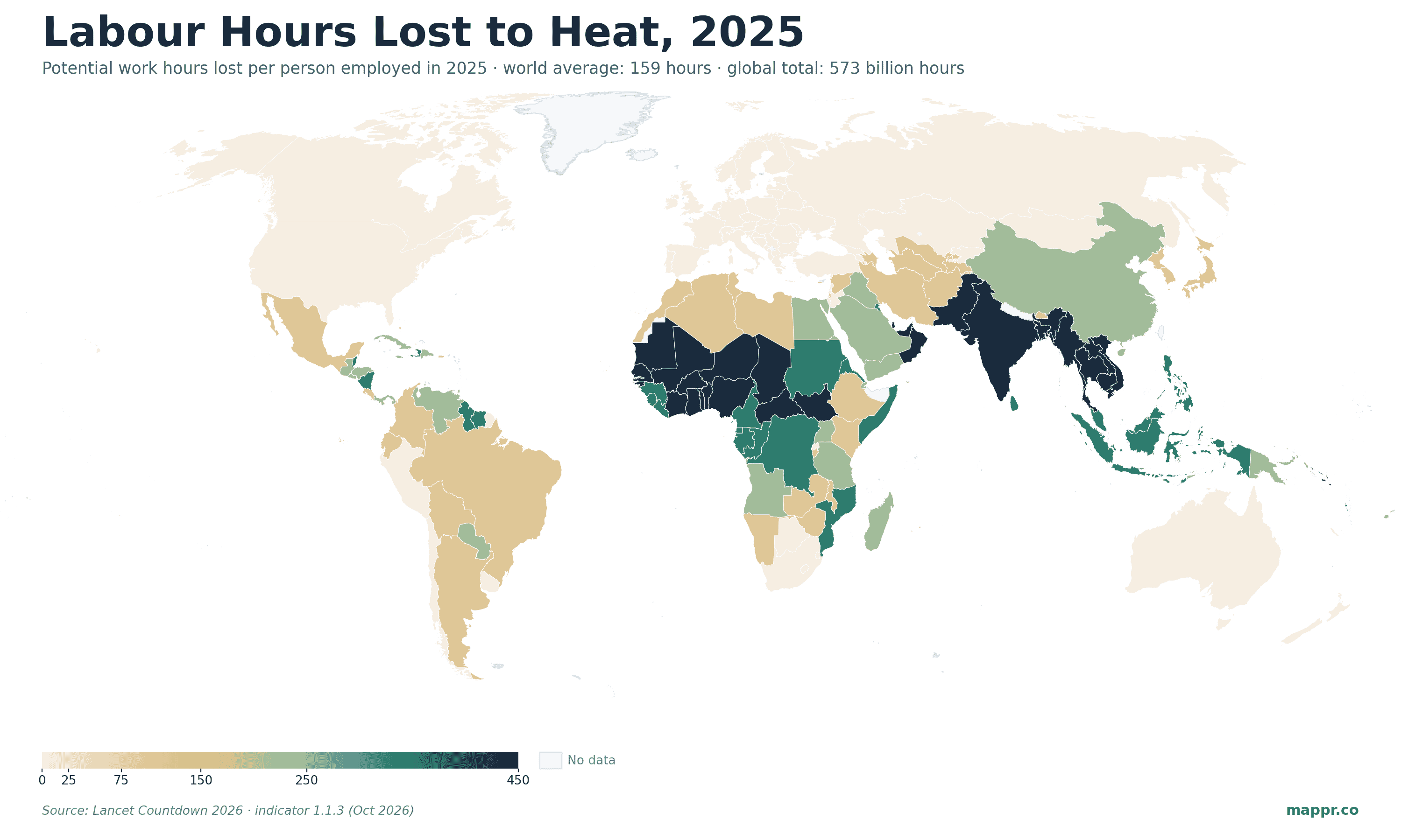
Here the map darkens along the Sahel and across South and Southeast Asia. Mali (448 hours) and Niger (437) lost the most per worker, more than eleven working weeks each, with Cambodia (410), Burkina Faso (406) and Bangladesh (393) close behind. These are economies where large shares of the workforce farm or build outdoors, with no air-conditioned fallback.
India sits at 352 hours per worker, and because of its workforce size it accounts for the single largest national share of the global total. Qatar (350 hours) is the reminder that wealth does not neutralise outdoor work in a Gulf summer.
The Heat Burden, Ranked
Lancet Countdown 2026
Where Heat Takes the Most From Workers
Potential labour hours lost per person employed in 2025, with each country’s average heatwave days per person
| Country | Hours lost / worker | Heatwave days / person |
|---|---|---|
| Mali | 448 | 5.2 |
| Niger | 437 | 3.9 |
| Cambodia | 410 | 0.3 |
| Burkina Faso | 406 | 11.2 |
| Guinea-Bissau | 402 | 0.5 |
| Bangladesh | 393 | 9.0 |
| Pakistan | 384 | 10.7 |
| Chad | 374 | 4.7 |
| India | 352 | 6.2 |
| Qatar | 350 | 7.3 |
| Myanmar | 344 | 2.5 |
| Benin | 332 | 20.2 |
A Record 710,000 Deaths, and a Push for an Emergency Declaration
The mortality numbers are the report’s news engine. Beyond 2023’s record 710,000 heat deaths, the Countdown’s first full attribution analysis ties nearly 3 million heat deaths between 2016 and 2023 to climate change, about two-thirds of all heat mortality in that period. The Countdown’s separate Europe report puts heat-attributable deaths there at around 62,000 in 2024 alone.
That is the backdrop for the political ask: 146 of the report’s experts called for climate change to be declared a global health emergency, and the WHO amplified the report on publication day. The demand lands directly on COP31, which opens in mid-November.
A note on what we could and could not map: the Countdown publishes heat mortality only at global and regional level, not per country, so the death toll appears here as context rather than as a map layer. The two mapped indicators, heatwave exposure and labour loss, are the per-country burden measures the report itself leads with.
What to Watch at COP31
Whether governments adopt the health-emergency framing or not, the structural picture in these maps will not move quickly. Exposure is rising on every continent, and the labour losses concentrate in the economies least able to absorb them, a pattern the Countdown has now documented for a decade running.
We will refresh these maps when the Countdown publishes its 2027 data year. The two layers worth watching: whether the heatwave-exposure average keeps climbing past 2024’s record, and whether any Sahel or South Asian economy manages to bend its labour-loss curve.
Sources: