Adult obesity is no longer concentrated only in rich Western economies. The highest obesity rates in the world are now heavily clustered in Pacific island states, parts of the Caribbean, and several Gulf countries, according to WHO 2022 data. The pattern says as much about food systems, urbanization, and dependency on imported processed calories as it does about individual lifestyle.
This map uses sovereign-country WHO 2022 obesity prevalence data for adults with BMI of 30 or higher. It excludes non-sovereign territories to keep the ranking clean and comparable across countries. The result is a striking geography of obesity, with Tonga, Nauru, Tuvalu, and Samoa sitting far above the global average, while countries such as Japan, India, and Ethiopia remain far lower.
This interactive choropleth map is built from WHO Global Health Observatory 2022 data, covering age-standardized adult obesity prevalence (BMI ≥ 30) across all sovereign countries. Non-sovereign territories are excluded for comparability. Hover over any country to see its obesity rate.
The Most Obese Countries Are Not Where Many People Expect
The top of the table is dominated by small island states. Tonga leads this sovereign-country ranking at 71.7%, followed by Nauru at 69.9%, Tuvalu at 64.2%, and Samoa at 62.4%. After that, the numbers drop sharply, but the wider pattern remains: the countries with the highest obesity rates are often places where traditional diets have been displaced by imported ultra-processed foods, sugary drinks, and calorie-dense staples.
The Bahamas, Micronesia, Kiribati, Marshall Islands, and Saint Kitts and Nevis all sit near the top. In each case, obesity is tied to a different mix of structural pressures: food import dependence, limited agricultural variety, sedentary urban lifestyles, car-oriented infrastructure, and in some cases rapid income growth that changed consumption habits faster than public health systems could adapt.
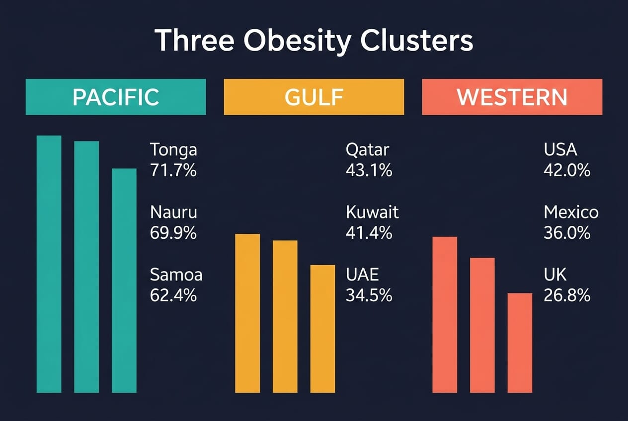
A Pacific and Gulf Concentration
The Pacific cluster is especially striking. These countries are small, remote, and highly exposed to imported food systems. Fresh produce can be expensive, while packaged foods are cheap, stable on shelves, and widely available. That combination has helped create some of the highest obesity rates on Earth. The issue is not simply personal choice. It is geographic isolation, trade dependence, and a nutrition transition that happened at national scale.
The Gulf states tell a different story. Kuwait (41.4%) and Qatar (43.1%) rank among the most obese countries in the world despite very different income profiles from Pacific island nations. Here, obesity is more closely linked to affluent, urban lifestyles, extreme heat limiting outdoor activity, and food environments saturated with convenience and restaurant calories. The same endpoint appears on the map, but the road into it is different.
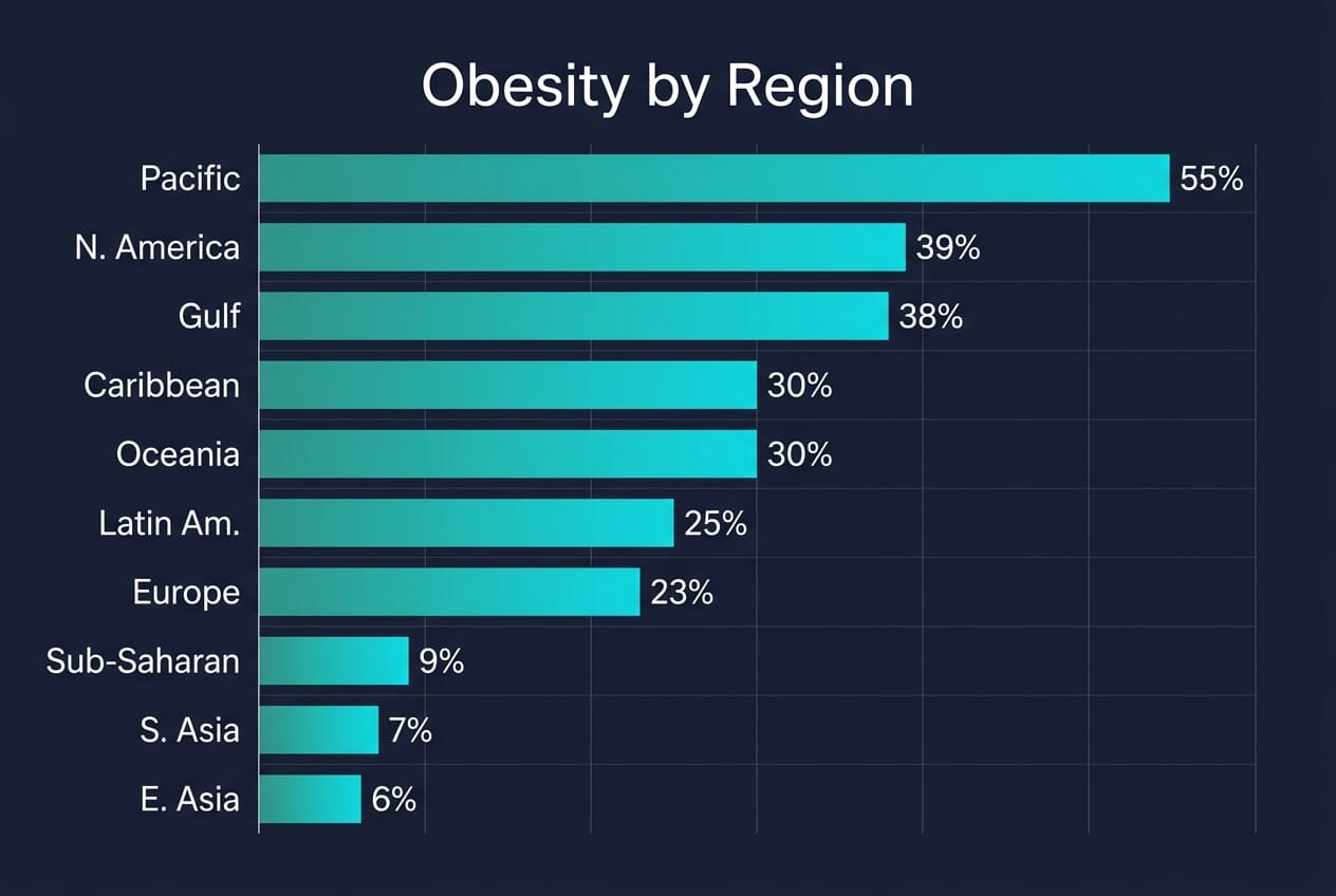
Obesity Rates by World Region
Averaging obesity rates across regions reveals a clear global gradient. The Pacific islands sit far above every other region at roughly 55%, driven by the extreme prevalence in Tonga, Nauru, and Samoa. North America (39%) and the Gulf states (38%) form a second tier, followed by the Caribbean and Oceania at around 30%. Europe and Latin America cluster in the low-to-mid twenties, while Sub-Saharan Africa (9%), South Asia (7%), and East Asia (6%) remain far below.
This regional picture reinforces what the country-level map shows: obesity is not randomly distributed. It follows patterns of food trade, urbanization, and economic transition. Regions that industrialized their food systems earliest, or that depend most heavily on imported processed calories, tend to sit at the top.
Where Major Countries Stand
Among large, globally prominent countries, the United States remains one of the heaviest major nations at 42.0%. Mexico is also high at 36.0%, reflecting the region-wide shift toward sugary beverages and processed diets. Australia stands at 30.2%, while the United Kingdom is at 26.8% and Germany at 20.4%.
At the lower end, Japan remains one of the standout low-obesity developed countries at 5.5%, with South Korea also far below Western levels at 7.3%. India sits at 7.3%, still relatively low in global terms, though that headline number masks a growing urban metabolic-health problem. In other words, low obesity prevalence does not necessarily mean low health risk everywhere, but it does show how different national food cultures and urban forms still shape outcomes.
The Least Obese Countries in the World
At the opposite end of the scale, several countries report adult obesity rates below 5%. Vietnam (2.1%), Bangladesh (3.6%), Ethiopia (3.3%), and Cambodia (3.0%) all sit near the bottom. Japan (5.5%) is the only high-income country in this range, a fact often attributed to portion norms, walkable urban design, a diet built around rice, fish, and fermented foods, and a cultural framework that treats eating as structured rather than casual.
Most of the lowest-obesity countries are in South and Southeast Asia or Sub-Saharan Africa. But the reasons differ. In some cases, low obesity reflects food insecurity and undernutrition rather than healthy diets. In others, like Japan and South Korea, it reflects food cultures and public-health norms that have resisted the global drift toward calorie-dense convenience eating. The distinction matters: low obesity is not always a sign that a country’s food system is working well.
How Obesity Rates Have Changed Over Time
Globally, adult obesity prevalence has more than doubled since 1990. According to the NCD Risk Factor Collaboration, more than one billion people worldwide now live with obesity — roughly 880 million adults and 159 million children and adolescents aged 5 to 19. The speed of change is one of the most striking aspects of the data.
The fastest increases have been in the Middle East, North Africa, and parts of the Pacific, where economic growth, rapid urbanization, and shifts in food imports converged within a single generation. In many Pacific island nations, obesity rates that were moderate in the 1980s crossed 40% by the 2000s and now sit above 60%. The Gulf states followed a similar trajectory, fueled by oil wealth, car-dependent infrastructure, and abundant cheap food.
Even countries with traditionally low rates are trending upward. China’s obesity prevalence has roughly tripled since 2000, and India’s urban centers are seeing metabolic-health profiles that increasingly resemble those of middle-income Western countries. The trend is near-universal — almost no country has seen obesity decline over the past three decades.
Africa: A Continent of Contrasts
Africa shows the widest internal range of any continent. North Africa sits dramatically higher than the sub-Saharan average. Egypt leads at 44.3%, putting it in the global top 10, while Libya (35.9%) and Algeria (29.0%) also rank well above the continental median. In these countries, urbanization, wheat-based diets, sugary drinks, and declining physical activity have pushed rates closer to Middle Eastern levels.
Sub-Saharan Africa, by contrast, remains mostly in the single digits. Ethiopia (3.3%), Uganda (5.3%), and Mozambique (5.6%) are among the lowest in the world. But the headline numbers conceal a growing split: urban populations in Nigeria, South Africa, and Kenya are seeing obesity rates climb sharply, even as rural populations remain lean. South Africa (31.3%) already sits above the United Kingdom, making it one of the most obese countries on the African continent and a sign of where the broader trend may be heading.
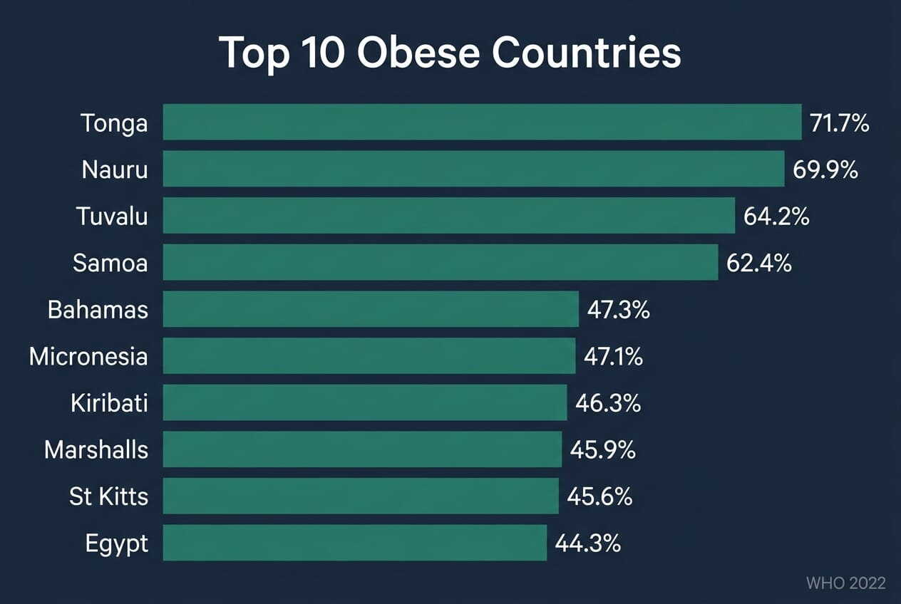
Top 10 Most Obese Sovereign Countries
- 🇹🇴 Tonga — 71.7%
- 🇳🇷 Nauru — 69.9%
- 🇹🇻 Tuvalu — 64.2%
- 🇼🇸 Samoa — 62.4%
- 🇧🇸 Bahamas — 47.3%
- 🇫🇲 Micronesia — 47.1%
- 🇰🇮 Kiribati — 46.3%
- 🇲🇭 Marshall Islands — 45.9%
- 🇰🇳 Saint Kitts and Nevis — 45.6%
- 🇪🇬 Egypt — 44.3%
What the Map Really Shows
This is not just a ranking of body weight. It is a map of national food systems. Countries become highly obese when cheap calories are easier to access than healthy ones, when daily life becomes physically passive, and when public-health responses trail behind economic and dietary change. That is why the same color on the map can describe very different national realities, from Pacific island import dependence to Gulf hyper-urbanization to North American overconsumption.
For readers, the useful takeaway is not moral panic. It is pattern recognition. Obesity follows infrastructure, pricing, trade, and culture. And once those systems lock in, reversing the trend becomes much harder than preventing it in the first place.
Sources and data used in this article:
Primary Data
- WHO Global Health Observatory — Body Mass Index – Adult obesity prevalence (BMI ≥ 30), age-standardized, both sexes, 2022 estimates
- World Obesity Federation Global Obesity Observatory – Cross-reference for country-level obesity rankings and trends
- NCD Risk Factor Collaboration — Lancet 2024 – Global obesity trends 1990–2022, estimating over 1 billion people now living with obesity
Method
- Map methodology – Interactive choropleth map built from sovereign-country WHO 2022 obesity data, excluding non-sovereign territories